Linux Stats
Impressive stats and infographics that demonstrate the power of Linux.
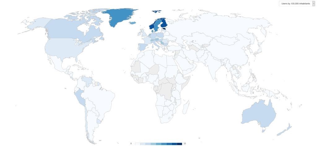
Maps of ratio and number of Linux users per country
Linux Netbook has created two interactive maps which show the ratio and total number of registered Linux users per country, using data from the Linux Counter project. You can see the values for any country by moving the mouse over its territory.
Why Linux is better than Windows
Data Alliance has created an infographic which shows why Linux is better than Windows. According to it, Linux powers lots of different devices, is free to use, can be tweaked according to people's particular needs, is based on open-source code and is much safer in comparison with other operating systems.
Linux then and now
This is a nice infographic which shows the operating system's growth within the last two decades, highlighting the number of developers who are working on the Linux kernel, the number of supercomputers that are using this O.S, the number of lines of source code in the Linux kernel, and more.
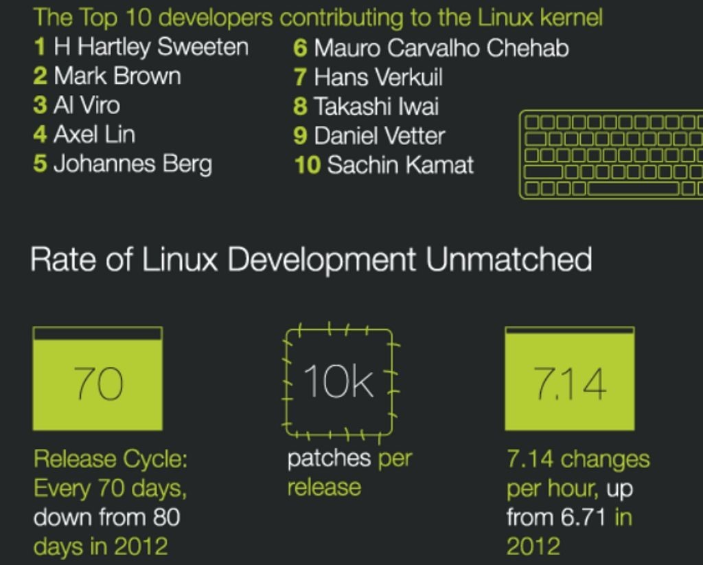
Who is contributing to the Linux kernel code?
The infographic above lists the top organizations and people who have contributed code to the Linux kernel. Big corporations such as Intel, Red Hat, The Linux Foundation and IBM are at the top of the list, but there are also small companies and even individuals who have worked hard to help make and keep Linux powerful and secure.
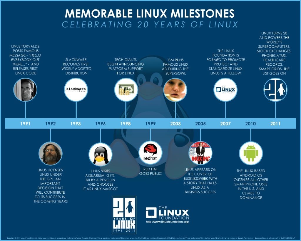
Celebrating 20 years of Linux
The Linux Foundation has created a great infographic which highlights the most memorable Linux milestones. The timeline begins with Linus Torvalds' first source code release, includes the wise decision to license Linux under the GPL, and so on.